CLEVELAND MAGAZINE REDESIGN x APRIL 2022
The Objectives: Flexibility and “less is more”. The How: Increase in page width, margins and gutters. More white space and minimal color. The headline font Flecha Bronzea by R-Typography, along with larger photography, gives personality to the page without cluttering it. Page categories that used to be the same every month were replaced with story tags above each individual article for more intentional content coverage. The Easter Egg: The previous design, done in 2010, had been inspired by the 1920’s art deco movement with repetitive shapes and angled lines. Although the rest of the recent redesign was a complete overhaul, I decided to take a different approach to the original art deco inspiration with the arch as the main design element repeated throughout the new look as a small nod to the magazine’s past.


^ BEFORE

^ AFTER


^ BEFORE

^ AFTER

^ BEFORE

^ AFTER

^ BEFORE

^ AFTER


^ BEFORE

^ AFTER

^ BEFORE

^ AFTER
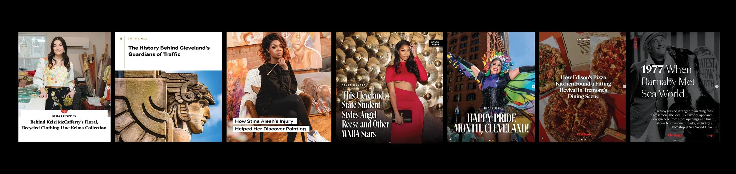
2020-2026 SOCIAL BRAND EVOLUTION
I have had the privilege of working at Cleveland Magazine long enough to see the social strategy progress from print content shared online, to Cleveland Magazine content shared in a more platform specific way with print as one of many outlets of equal weight. Above are the different iterations of a “headline post” over the years, ending with carousels that give the reader more information on the platform. Cleveland Magazine’s goal is always to provide a service where readers find the brand, but ultimately guide the audience to read the full, final product on the website.